Exploring the Skin and Bone convicts data
Focus: making some sense of a lot of messy data
About the data
The DP collection has been sourced from physical descriptions of prisoners and convicts in data held by the Digital Panopticon.
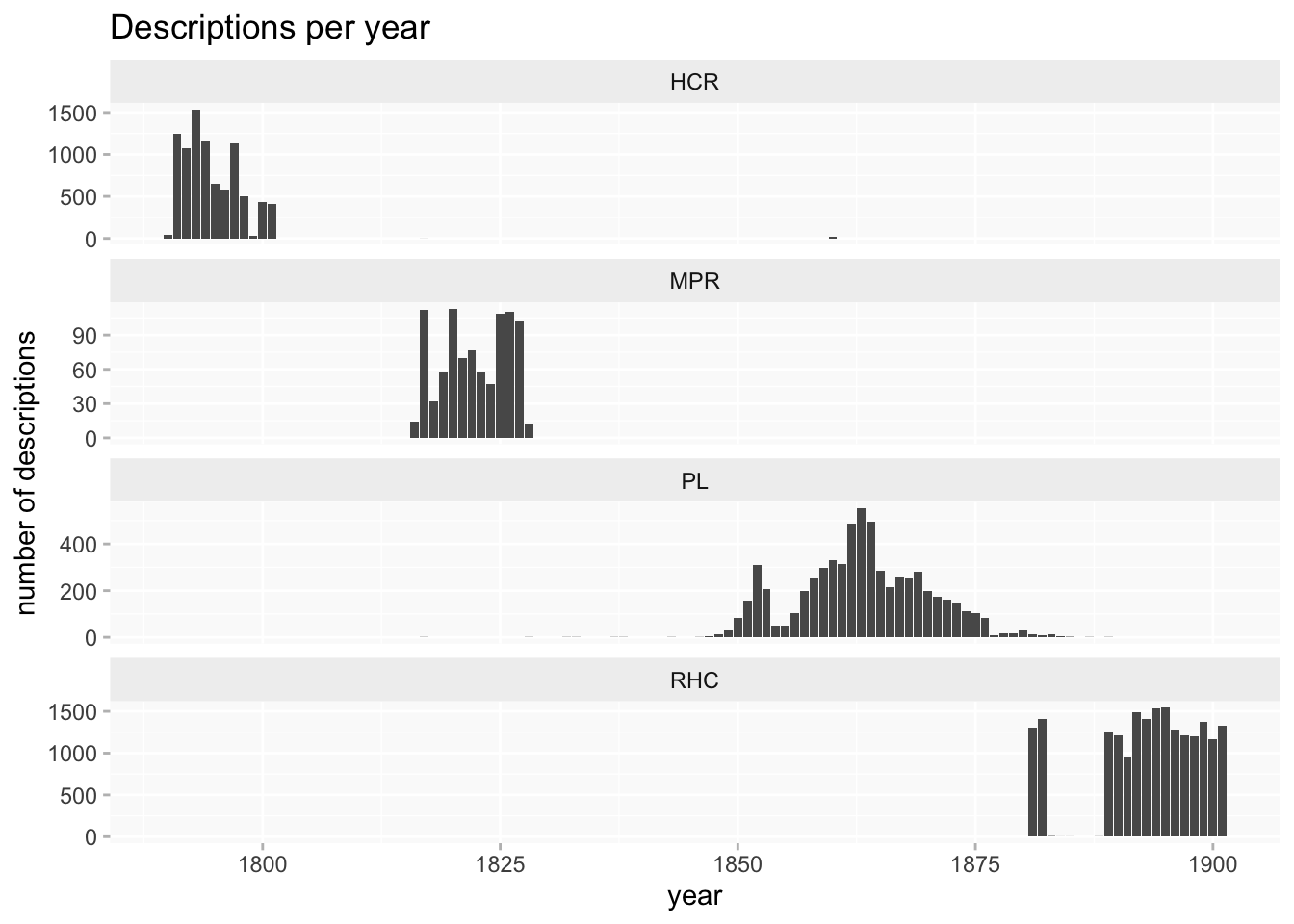
Four datasets in DP have this type of description and include Londoners between 1760 and 1901 (see linked pages for fuller documentation):
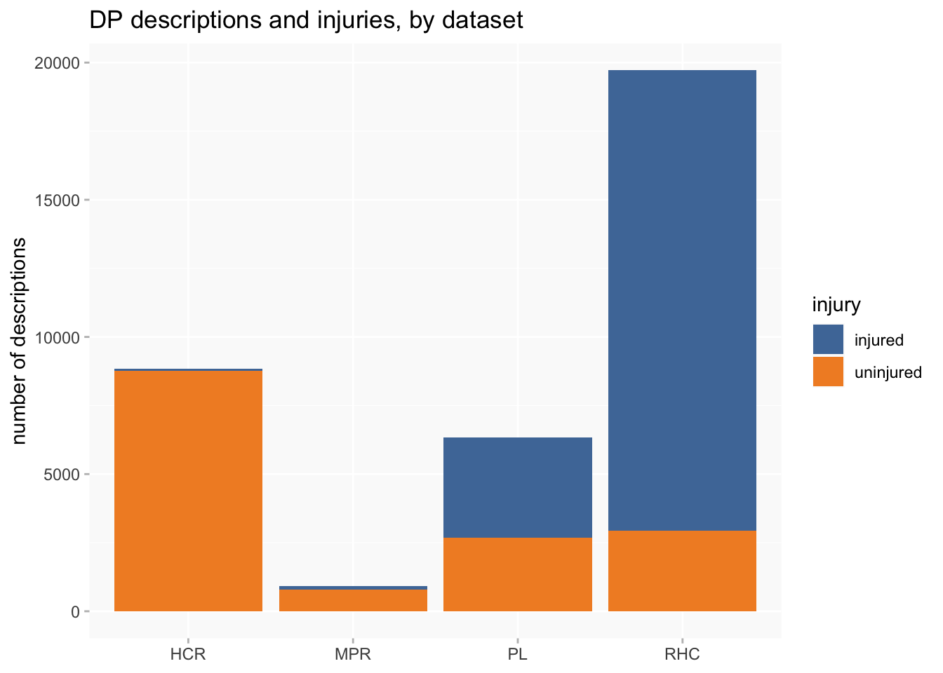
- Home Office Criminal Registers 1790-1802 [HCR] (8833 descriptions)
- Millbank Prison Registers 1816-1826 [MPR] (914 descriptions)
- Prison Licences 1853-1883 [PL: split into PLD for female convicts (880); TLM for male convicts (5461)] (6341 descriptions in total)
- Metropolitan Police Register of Habitual Criminals 1881-1901 (19716 descriptions)
Caveats and challenges
The DP collection is by far the largest Skin and Bone dataset, and the physical descriptions it contains are in many cases the most detailed records we have. However, they’re also the most difficult to work with and to interpret.
data quality
In fact, I can pretty much repeat the caveats for the tattoos data (extracted from the same sources), with a few slight variations.
Users of the data should be aware from the outset that the dataset is a very long way from perfect; extracting tattoos from the descriptions was a major challenge for a small project with limited funding. It is likely that many tattoos (especially the “long tail” of rare tattoo designs) have been missed, and conversely things that were not tattoos have been misidentified. The process aimed not simply to find tattoos but also to associate them with body locations, and this could also go wrong in various ways.
Just one example which illustrates some of the difficulties:
Scar forehead, right eyebrow, right ear, left cheek, left side of nose, both sides of neck, lip, right arm elbow, right leg, right shoulder. I.L.M.K Liverpool E.R on right arm, ears pierced, lost several teeth. [Bridget Lacking, sentenced to penal servitude 1881]
The descriptions consist of small, mixed pieces of information, in no fixed order, with unreliable punctuation and frequent but inconsistent use of abbreviations. Tattoos were often grouped together by body location (and I think that can happen with injuries too), but in these two examples we have the opposite problem, with several locations grouped together by injury type.
Some features are ambiguous and interpretation depends on context. We can be confident that “ears pierced” isn’t an injury, but “pierced” in some other location could well be. Quite a lot of convicts have “lost” teeth and we can’t know whether this is due to injuries or poor dental health (though the latter feels very likely in this period).
NB: It’s possible for a person to have multiple descriptions (and a small number of people have several), but the average is only fractionally over one, so I’ll generally count per description or per injury.
a lack of balance
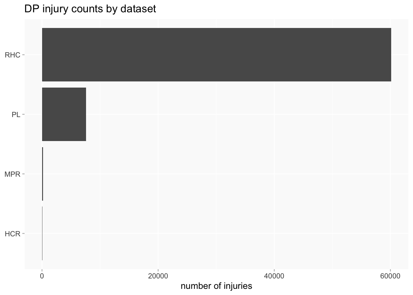
A second set of problems for data analysis and visualisation arises from several very unbalanced features of the collection. The RHC data completely dwarfs the other datasets, and the amount of information about injuries we can expect to find varies considerably between datasets.
This is even more pronounced when counting injuries rather than descriptions or people, because RHC averages a higher number of injuries per description.
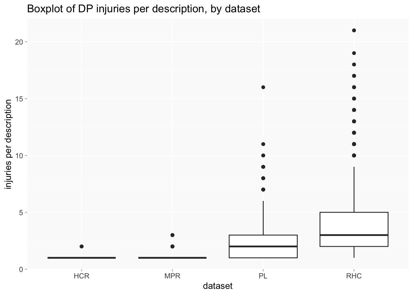
Arguably, the size of RHC means that any analysis that doesn’t in some way separate out datasets might as well just throw the other three away, because they’ll be more or less invisible anyway.
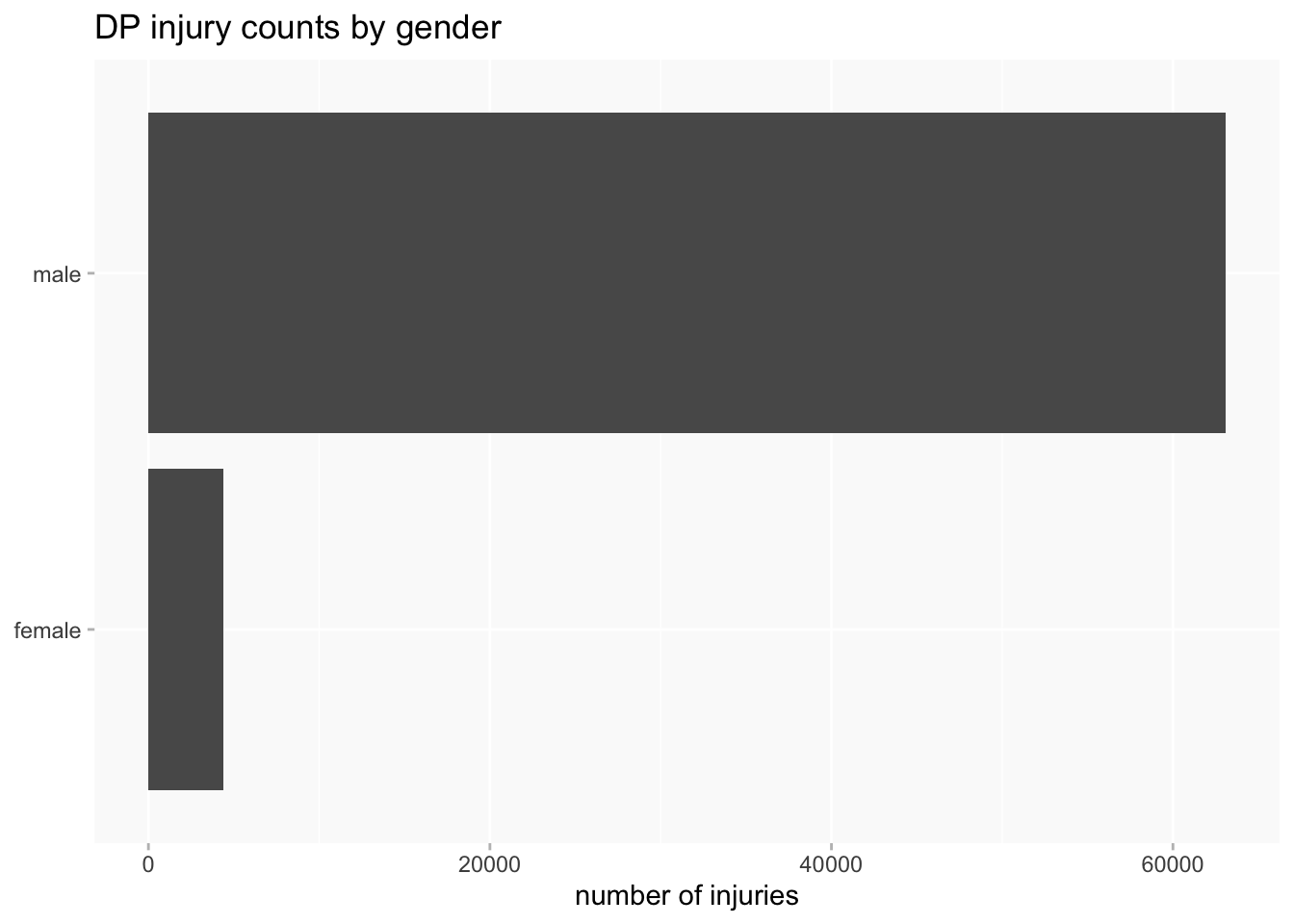
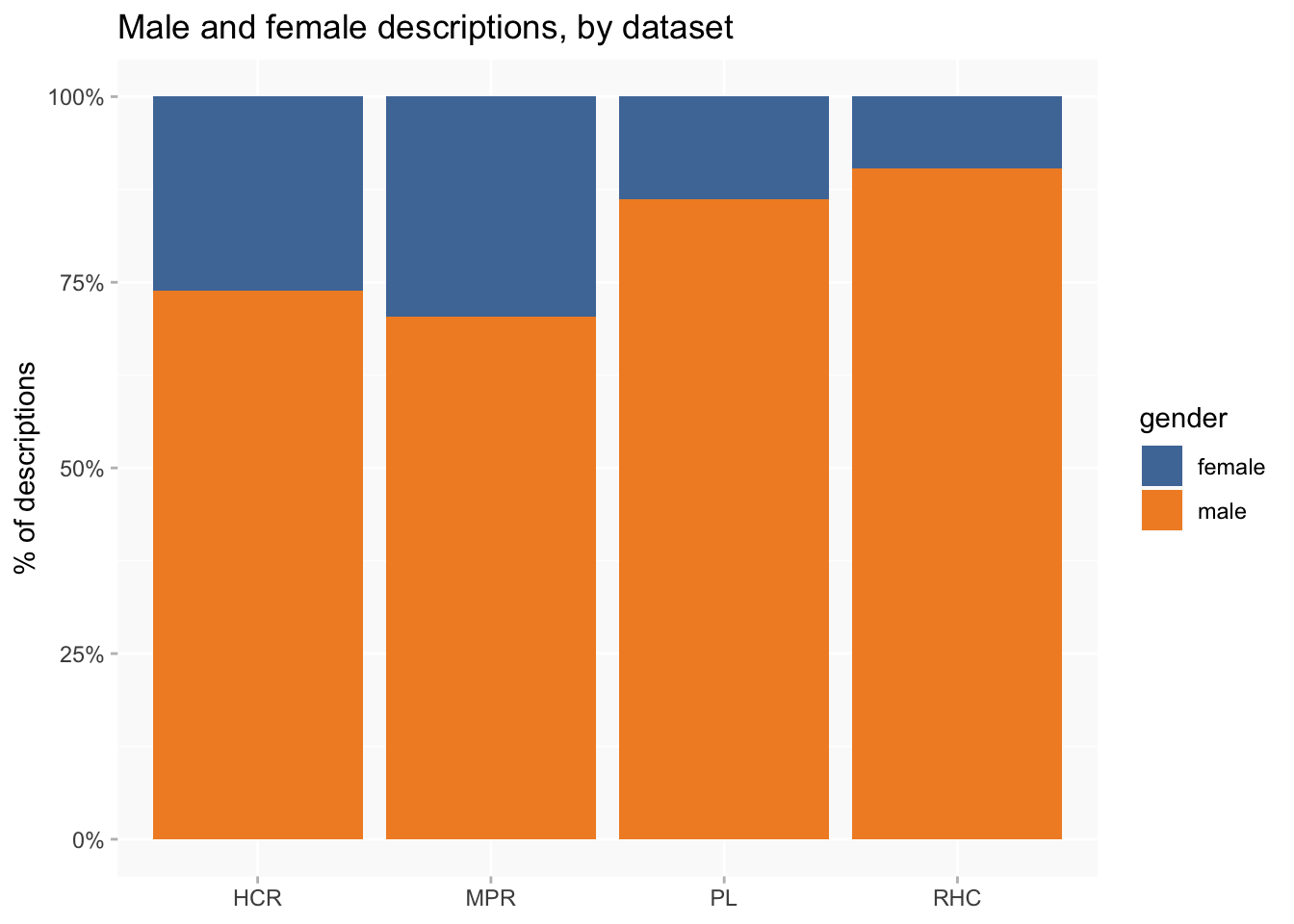
The same goes for gender: men massively outnumber women, which is a pretty normal feature of datasets about criminal offenders. Only about 15% of descriptions are of women. And men have more injuries than women do per description, so the difference is even more pronounced if counting injuries instead of descriptions.
Injuries themselves are very unevenly distributed in terms of both locations and types, which often makes effective visualisation very difficult.
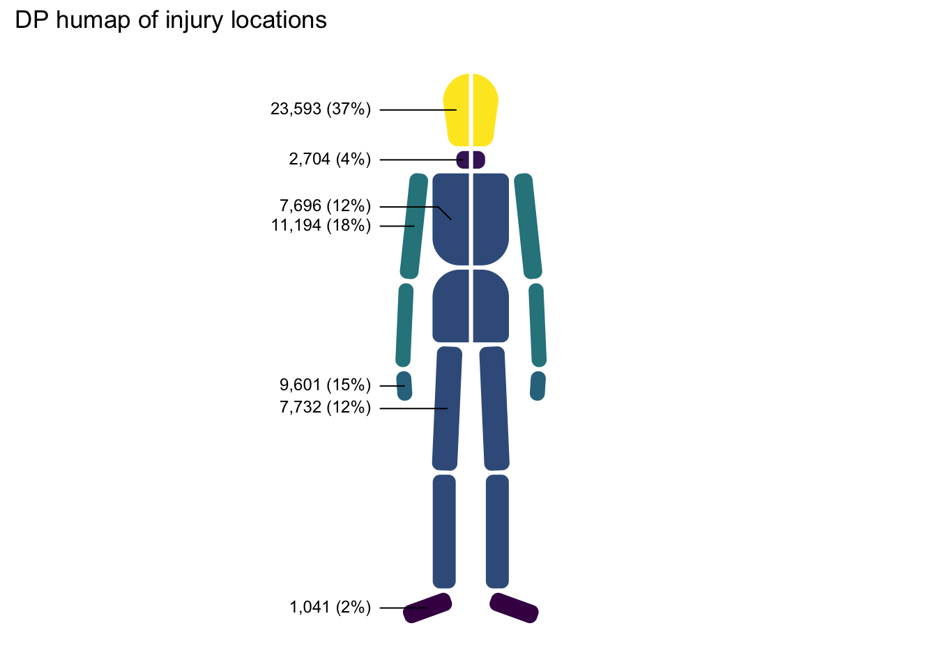
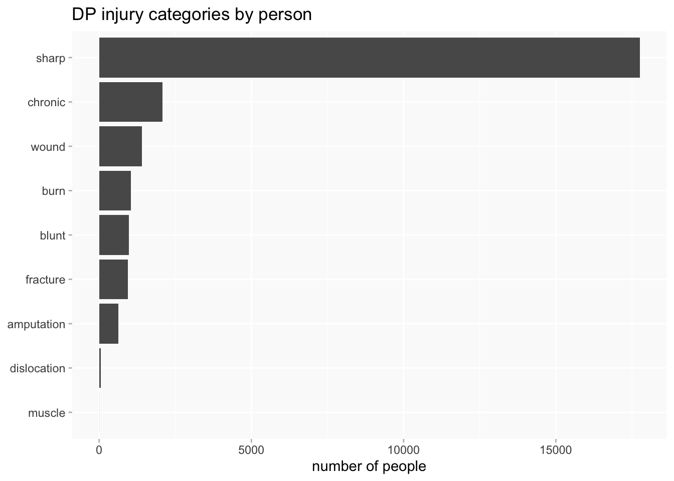
Head injuries dominate injury locations.
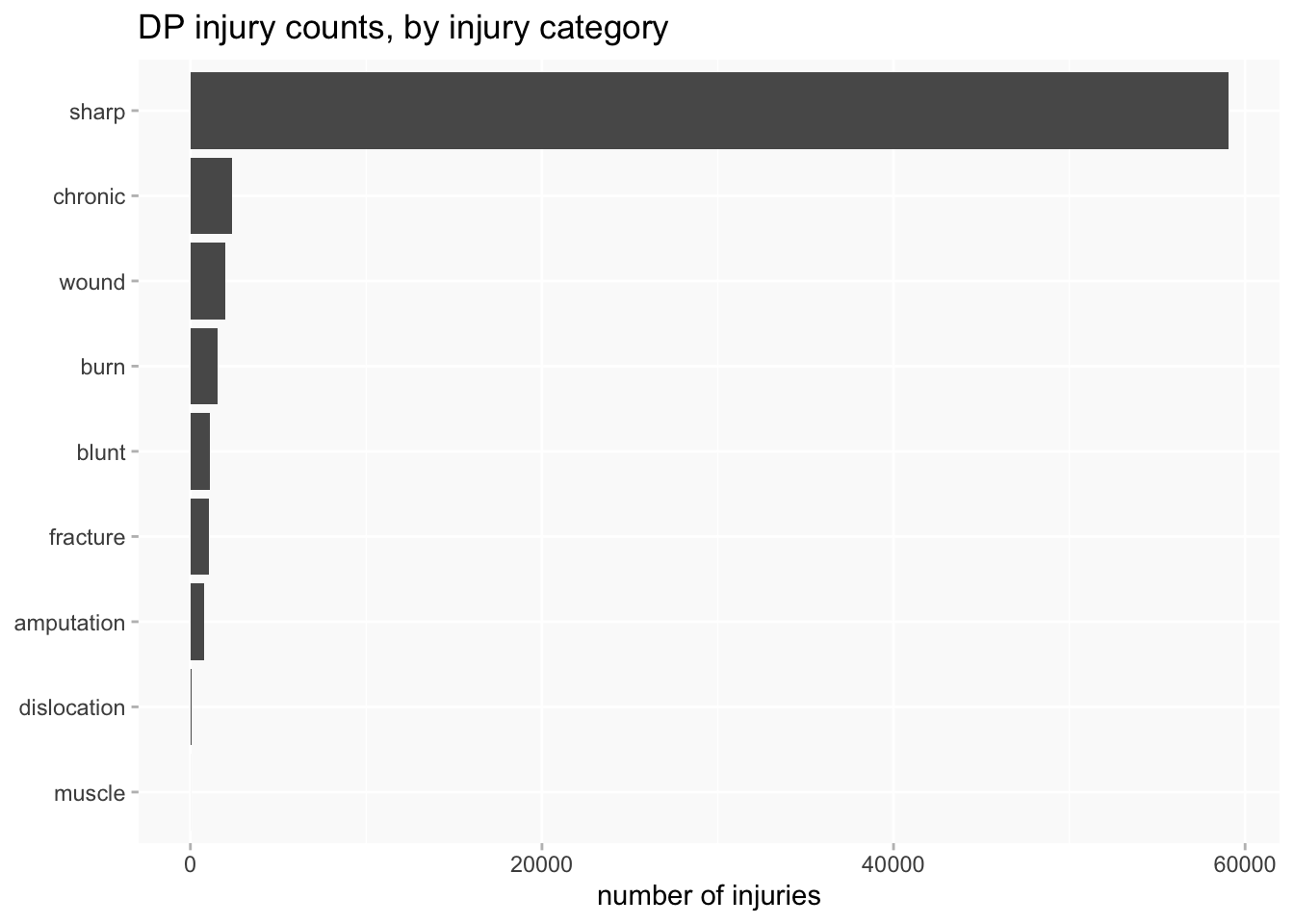
But types of injury are even worse: 86.5% of injuries are in the “sharp” category. Most of these are injuries that are described as “scars” and may have been quite minor (and very old) injuries. The numbers are so large because many individuals had multiple scars (in the Bridget Lacking example above, she had scars on 10 different parts of her body).
This is not a very useful bar chart.
I might count distinct injury types per person or description, rather than individual injuries, but it doesn’t really make a massive difference to the problem.
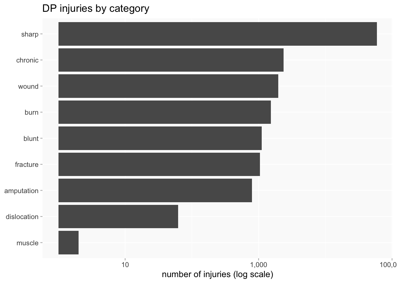
One answer is to use a log scale, but that’s not so immediately intuitive to all audiences and needs to be handled with care.
When comparing variables of very different sizes, using proportional charts is often effective. The downside is that there’s now no indication of numbers. It’s only effective with a small number of distinct values; this is pushing at the limits for me.

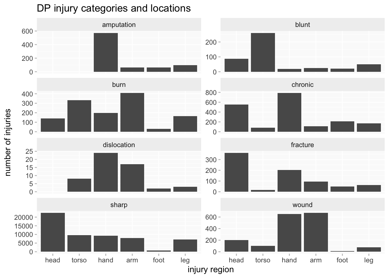
Another approach can be to use faceting (aka “small multiples”), in combination with independent scales per facet which make them, in effect, proportional. This enables me to focus on comparing the shape of the breakdowns, whilst still having numbers available for a sense of differences in scale.
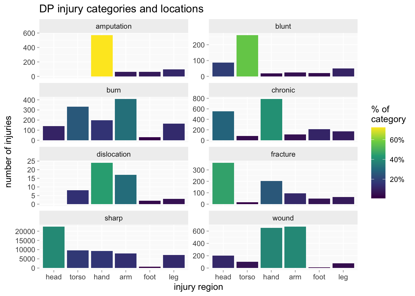
The faceted bar chart can also be enhanced by adding a heatmap-like dimension, with the shading of each bar indicating proportion of the injury category (yellow= highest and dark blue=lowest). That helps to focus on what may be more significant differences (not just minor variations).
One more problem is that (like the hospitals data) there’s very little overlap between the datasets, just a couple of years at the beginning of RHC and end of PL. Only PL covers much more than a decade and there are long gaps between them. Combined with the variability in recording of injuries, this would make any analysis of long-term trends even more problematic. If there are differences between datasets do they reflect change over time or differences between the offenders represented in each dataset?
Comparing datasets
Even if I can’t be sure what it all means, I do want to know if there are any significant or simply interesting differences between datasets. I’ll try out some comparisons using injury categories and injury locations.
injury categories
I’ve excluded the smallest categories. HCR is too small to make much of its rather different pattern. There are minor variations between the other three datasets (eg we can see from the brighter yellow that the highest concentration of sharp injuries is in PL) but the distributions are broadly similar - except for the curious absence of fractures in MPR.

injury locations
Injury locations don’t vary much between datasets: head injuries are the largest category (a slightly higher % in HCR/MPR than in PL/RHC), and the distribution of hand/arm/leg/foot injuries are similar in each dataset (even the tiny HCR set is not that different from the others this time).
The main variation is in the frequency of torso injuries. Their absence in HCR could be consistent with my theory about why that dataset is less likely to record injuries in the first place. Along with the lower frequency in MPR, and the shared higher % of head injuries, there’s a possible hint of the state’s growing willingness to scrutinise and police prisoners’ bodies during the 19th century (a big theory to hang on small amounts of data, but I’m just exploring here…). This is moving a long way from the project’s focus on experiences of injury, but it underlines how that can’t be properly understood without some attention to the creation of the original sources.

gender
There is clear variation between datasets: RHC has the lowest proportion of women (about 10%) and MPR the highest (nearly 30%).
I’m not concerned here with why that’s the case, but would probably be thinking about likely differences between the kind of offender to be found at Millbank Prison in the 1820s and those convicted as “habitual criminals” more than half a century later. The invention of the category reflected growing anxieties about recidivism, and it wouldn’t be surprising if this was more focused on men than women.
A look at injuries and gender
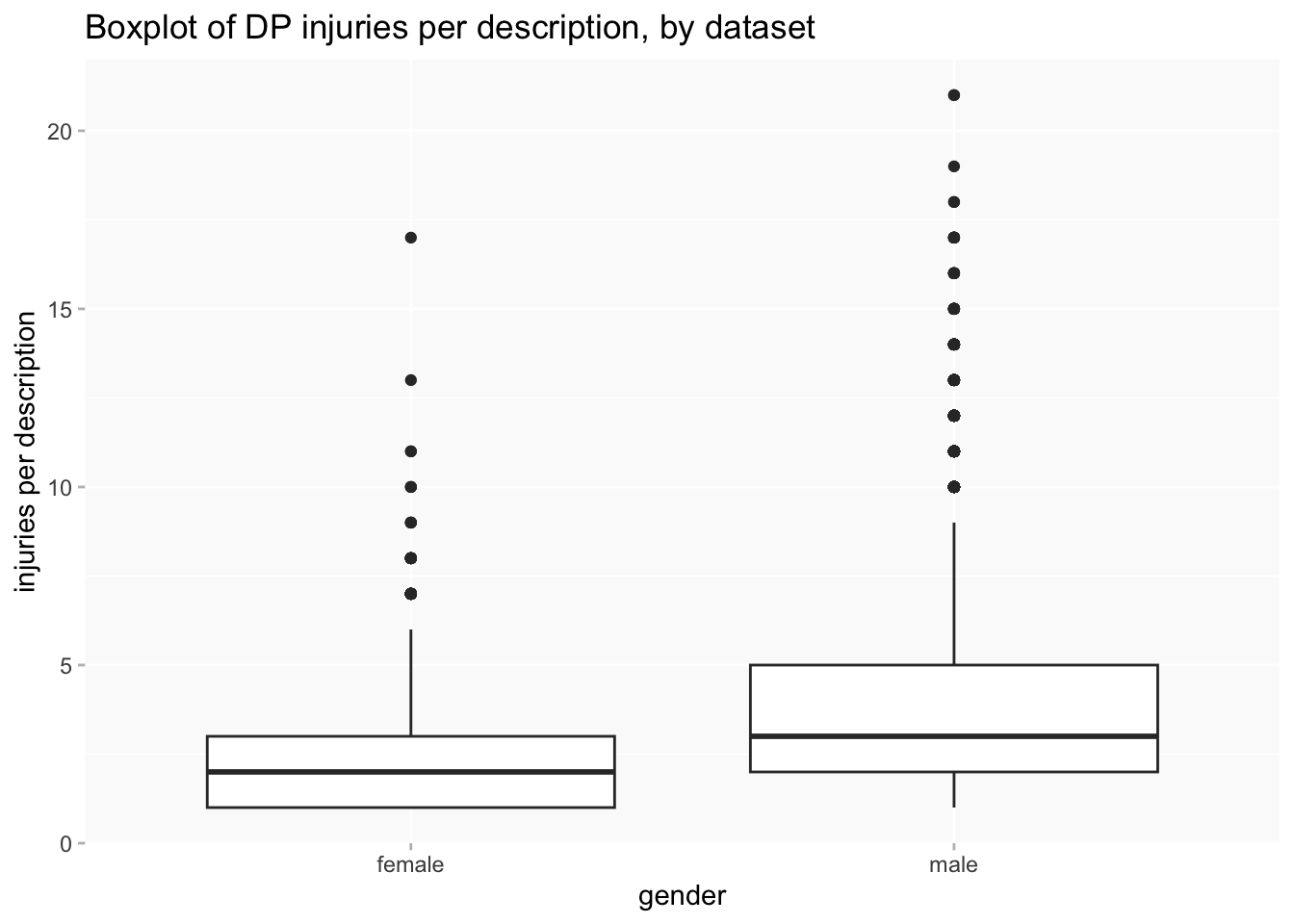
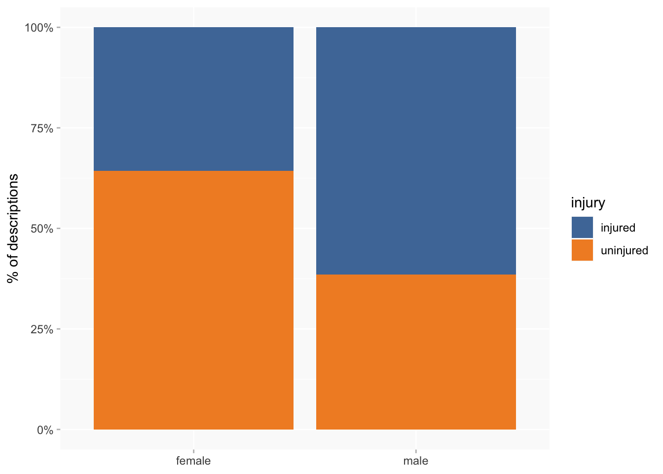
I’ve already noted that men tend to have more injuries than women, and so it’s not surprising that a higher proportion of women than men have no recorded injuries at all. But the difference is even larger than I expected: 36% of female descriptions have at least one injury, compared to 61% of male descriptions.
A breakdown of injury categories by gender also suggests some interesting variations, though differences are quite small. It seems that women are more likely to suffer fractures and burns than men, and men are more likely to have wounds and chronic injuries.
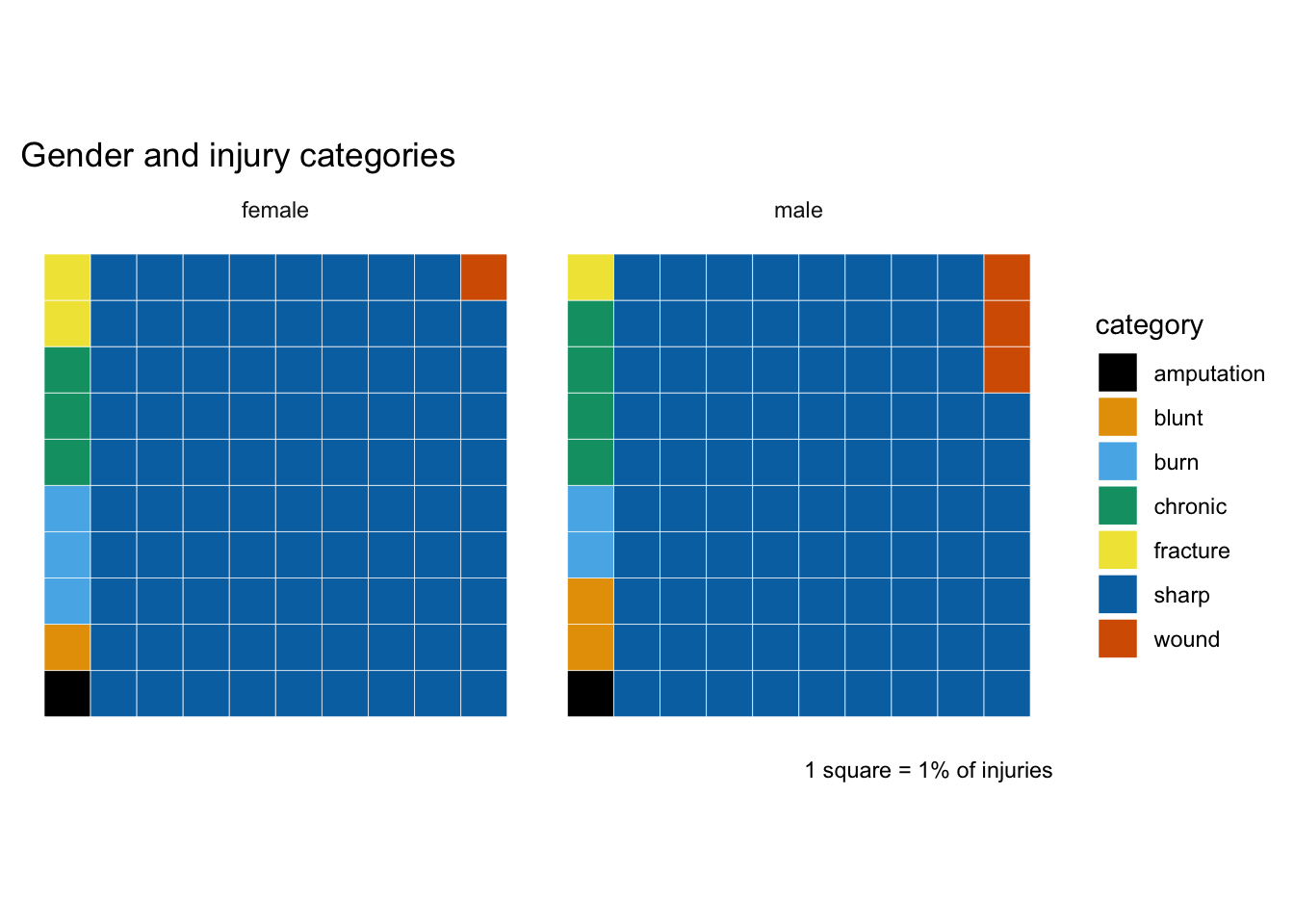
The proportion of sharp injuries is very similar for male and female, so let’s filter those out and take a closer look at the rest. I think it’s easier here to distinguish which are more significant variations: burns and fractures for women and wounds for men still stand out (whereas I think the variation for chronic is less notable). On the other hand, amputation now appears as a more significant difference.

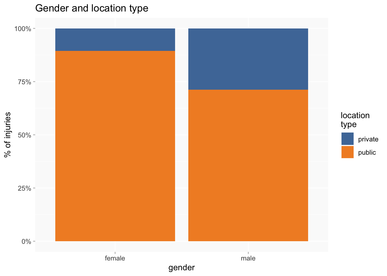
The waffle chart for injury locations is quite a bit easier to read than the one for categories. Head injuries are clearly more associated with female, cf. torso and leg for male.
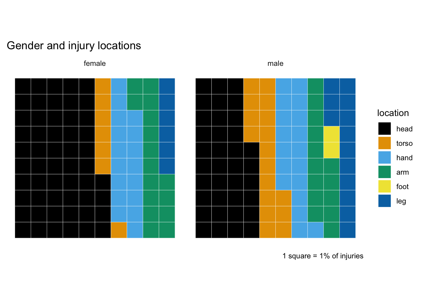
Those variations are quite suggestive of a gendered difference between “private” and “public” body parts. So I’ll group together as “private” body parts: torso (including shoulders but excluding neck if that’s been put in torso rather than head) and legs; “public”: head, feet, hands and arms.