Exploring the Skin and Bone hospitals data
Focus: time and seasonality in hospital admissions
About the data
Data originally collected by Madeleine Mant, based on admission and discharge records of four hospitals:
- St Thomas’ (STH) (1774-1800 with many gaps)
- Guy’s (GHS) (1813-38)
- Royal London (RLH) (1760, 1791-92, 1805)
- Middlesex (MXH) (1760-64, 1771-88)
Records vary in detail: the bare minimum is name, date of admission and reason for admission. Injury descriptions are quite brief and lacking in detail (eg, they very rarely record side of body), and only the specific injury that caused admission is likely to be recorded.
RLH has the richest set of data, also having place of abode, occupation, age and result of hospital stay for most individuals, but only covers 3 1/2 years. GHS has age data for about a quarter of the records. Discharge information is available for most RLH records and about a quarter of MXH. STH is quite fragmentary.
More detailed information about the sources can be found in Madeleine Mant’s PhD thesis, Slips, Trips, Falls, and Brawls: Fractures of the Working Poor in London During the Long Eighteenth Century (McMaster University, 2016).
Injuries and chronological patterns
Generally, it seems reasonable to assume that an injury would have occurred shortly before admission, so this data is ideal for exploring changes over time or seasonal patterns to injuries.
STH and (at least to some extent) RLH only admitted patients once a week, so it’s not possible to be more precise than that; here I’ll use monthly numbers and focus on years without gaps in the surviving registers.
The R Epidemiologists Handbook has a helpful introduction to time series analysis with R.
I’m using some features of the tsibble package in data processing.
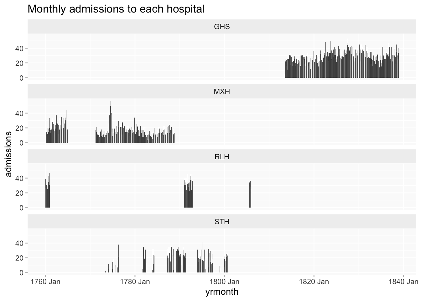
Chronological overview
This shows the lack of overlap between most of hospitals’ data, which may make it difficult to talk about long term chronological patterns, as it could be muddied by possible differences between hospitals.
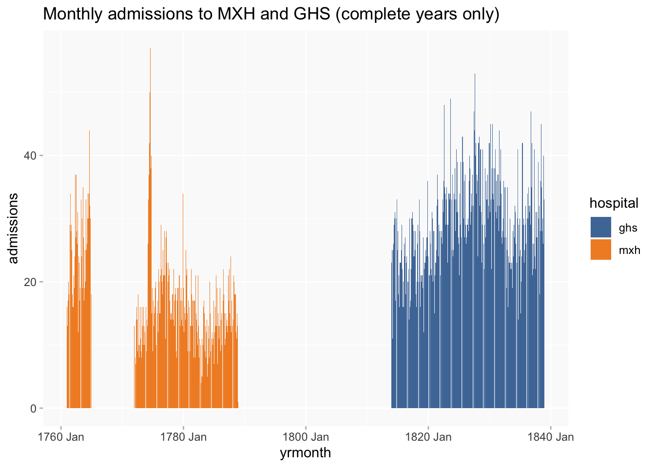
Since STH is very fragmentary and RLH only has three complete years, I’ll remove them from subsequent analysis to focus on the two hospital with good runs of full years, MXH and GHS.
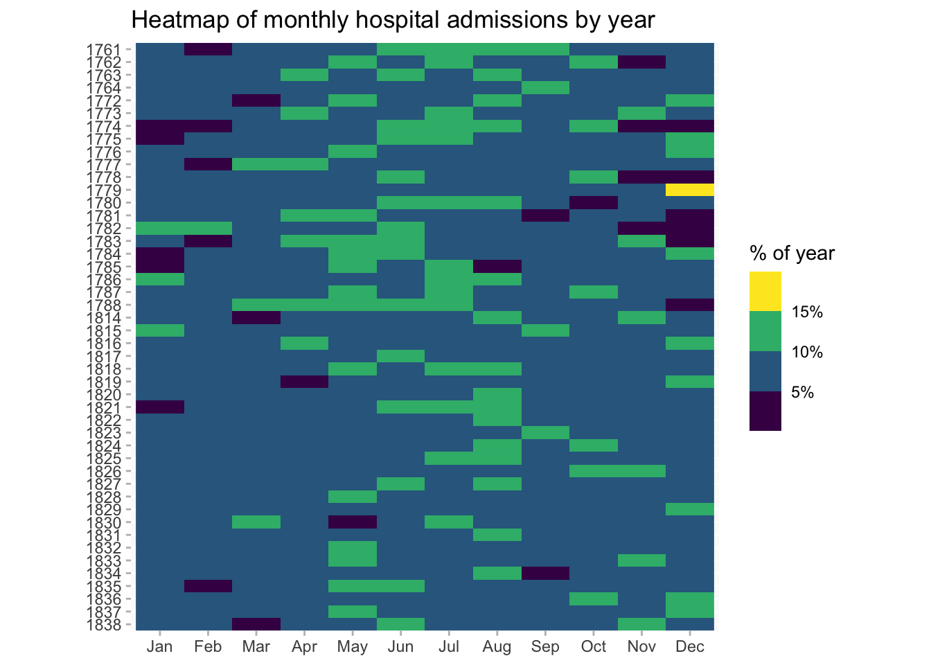
There’s a lot of fluctuation, but MXH has mostly smaller monthly numbers. (Though why does MXH have a sudden large spike in numbers in 1774? That may need checking out. Also interesting that its numbers look higher before than after the gap in records 1765-71.)
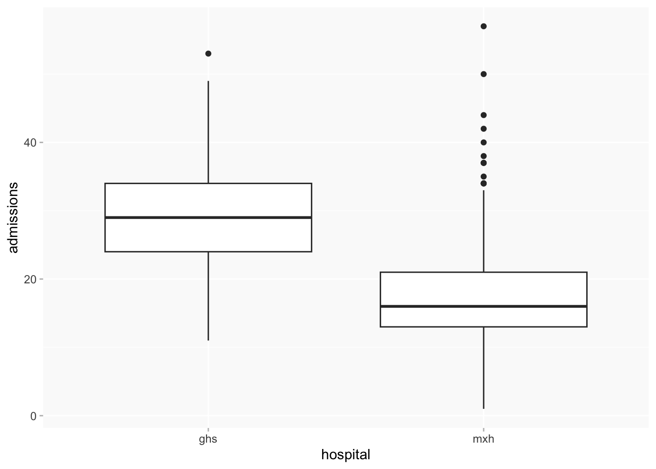
Boxplot of monthly admissions per hospital confirms much smaller numbers for MXH.
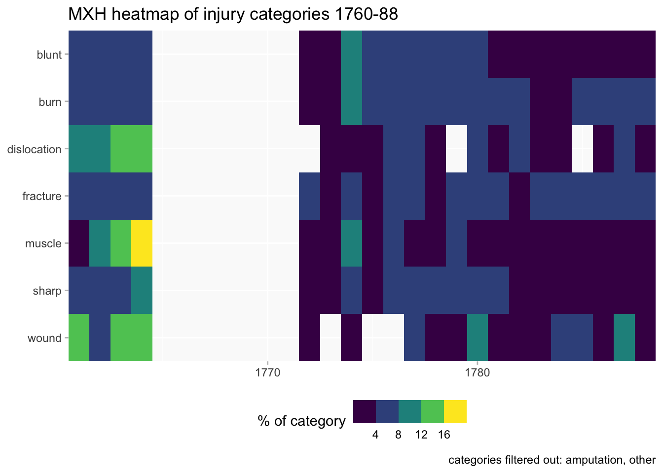
injury categories over time
Is there any significant change in the distribution of injuries with which people are admitted over time?
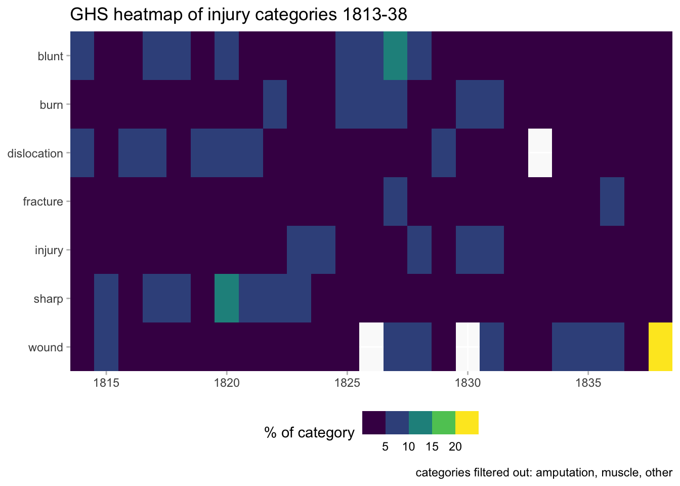
Filtering out a few categories that constitute <1% of the total for each hospital; there are some differences between the two hospitals which I won’t investigate here. Eg, muscle = 6.6% of MXH but <1% of GHS; injury doesn’t appear as a category in MXH but 35% in GHS. The former might be an actual difference in hospital intake; the latter is more likely a difference in recording practices.
The heatmaps are proportional rather than using raw numbers since there’s a lot of variation in category sizes. Even with the filters, some of the annual numbers could be very small. (White blocks in the heatmap = zero.) These are more likely to help with highlighting possible areas of interest for further exploration than to provide definitive findings.
MXH heatmap confirms generally higher numbers 1760-64, before the gap in records, but also highlights certain categories in that period - dislocation, muscle and wound. After the resumption, distribution of injuries seems much more even.
For GHS the distribution overall looks less variable than in MXH except for a possible surge in the wound category right at the end of the period.
Seasonality heatmaps
NB: This is not taking into account different length of months; 30 vs 31 days doesn’t make any visible difference, but needs to be borne in mind when looking at February.
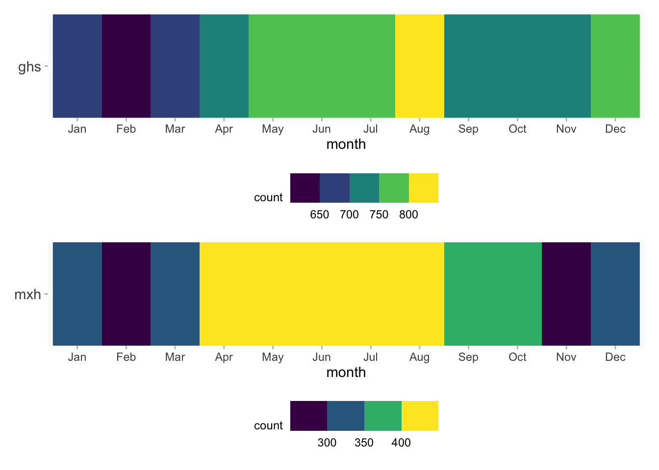
If I want to combine the data for both hospitals in one chart, it’s better to do proportions than numbers again because of the differences.
The heatmap doesn’t suggest any major changes over time. But it does hint at a concentration of admissions in the middle months of the year, slightly more marked in the earlier MXH years (as well as one noticeable outlier that could would need further examination).
by hospital
Comparison of the two hospitals confirms the seasonal pattern is stronger for MXH than GHS, though it’s still present in the latter. In GHS, but not in MXH, December looks slightly more concentrated than the preceding and following months. (February is slightly exaggerated in both due to being a short month and if that’s taken into account it’d be much the same as Jan and March.)
by gender
Comparison of gender highlights that the summer pattern is much stronger for men than women. Why would there be more female injuries in May?

(there isn’t enough age data to do the same chart for age groups.)
by injury category
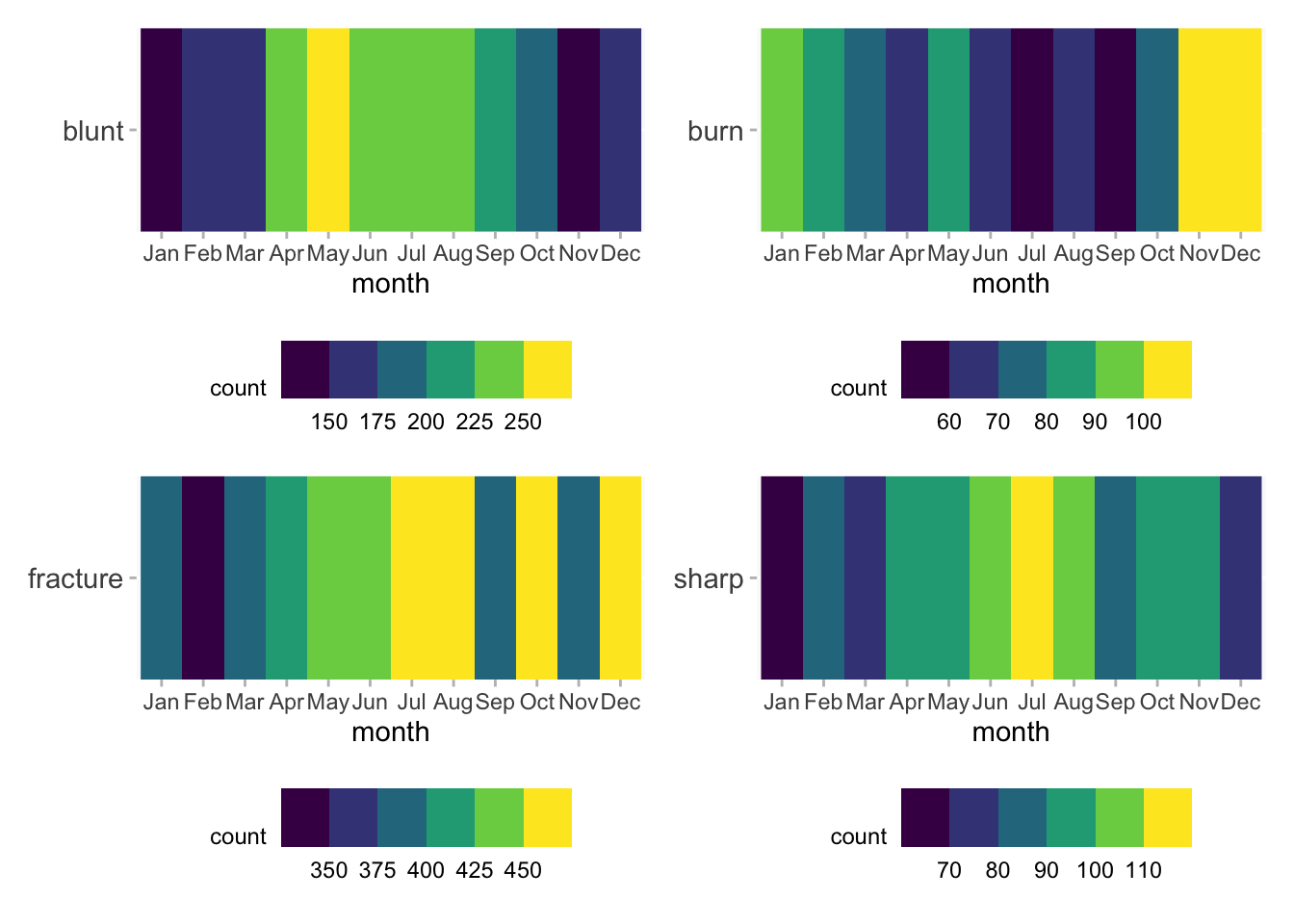
A look at the four most frequent injury categories overall (excluding non-specific injury).
Sometimes a visualisation tells you something that hadn’t occurred to you but is obvious in retrospect: burns are most frequent in the late autumn and winter months (but why more so in Nov-Dec than in Jan-Feb?). The other three categories are on the whole following the summer months pattern, though fracture is… interesting.
by body region
And finally a breakdown for the four most frequent body regions (excl unknown). Again, tending to point to the summer pattern, but some more strongly so than others.
